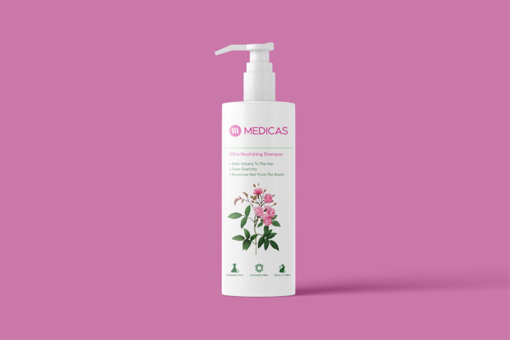
Medicas represents a natural skincare brand that utilizes organic ingredients in its nature-inspired offerings. The logo features three horizontal stripes that form a delicate “M,” reminiscent of overlapping leaves or the growth rings of a tree, paying homage to natural elements. The typeface employed is a smooth sans-serif with gentle curves, deliberately avoiding sharp edges to align with the brand's lifestyle. The color palette consists of soft green and white tones, evoking a sense of being au naturel.
The packaging highlights organic textures and straightforward botanical imagery, such as leaf veins and dewdrops, paired with approachable yet polished typography for product names rendered in medium-weight capital letters. Ingredients are displayed in a softer, rounder secondary font. Additionally, batch codes are meticulously positioned beneath the stripes, ensuring that every detail seems intentional.