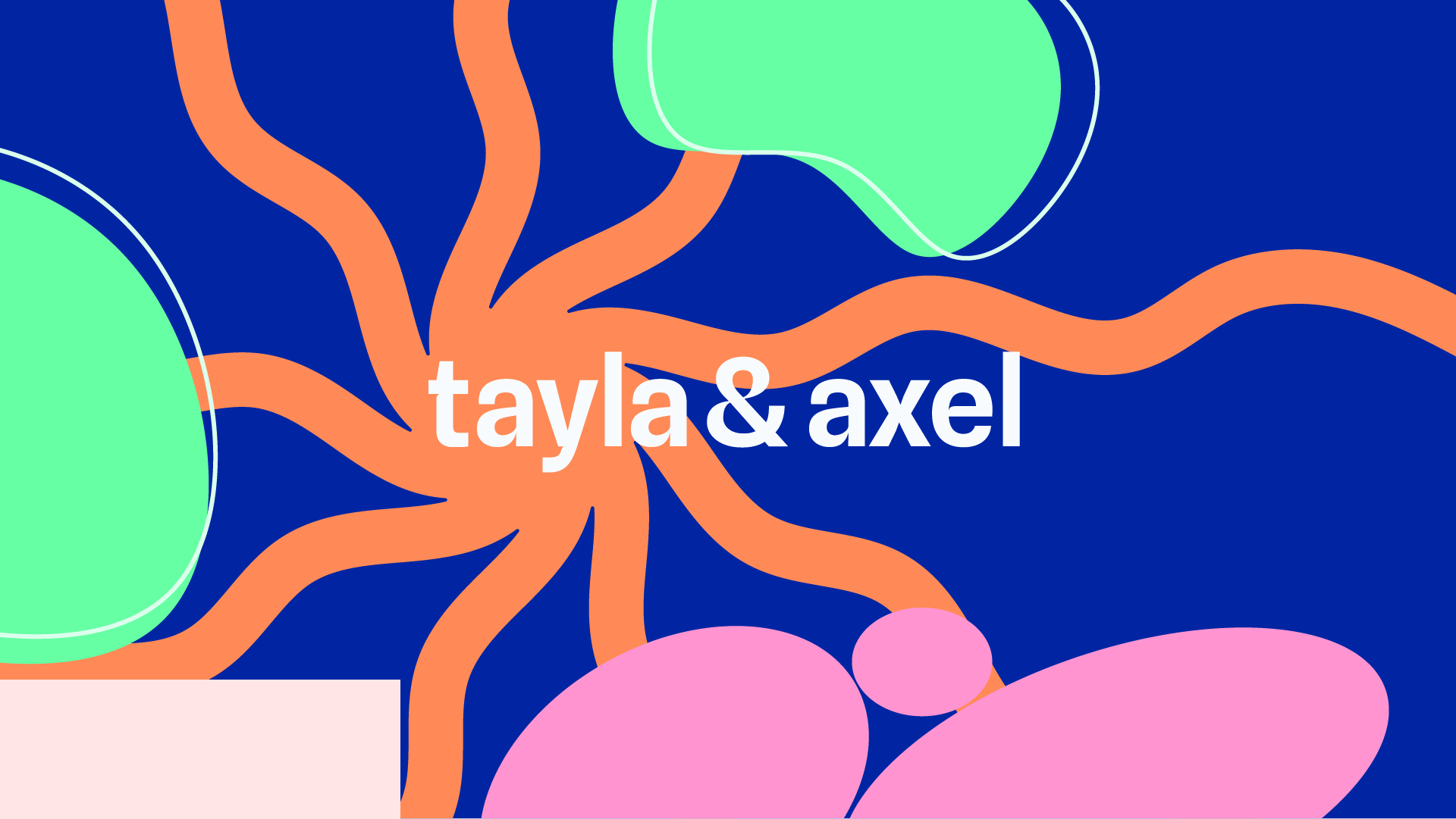

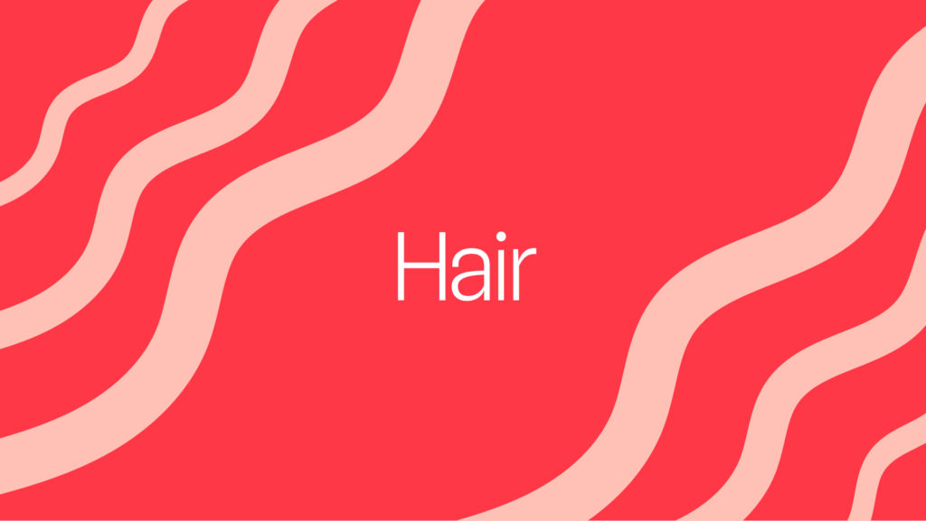

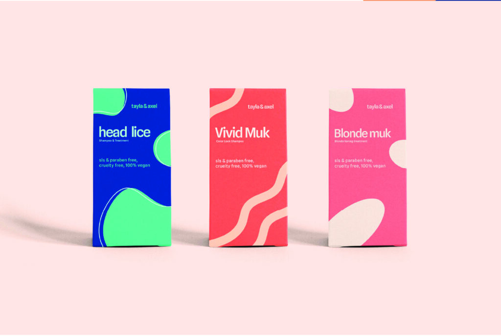
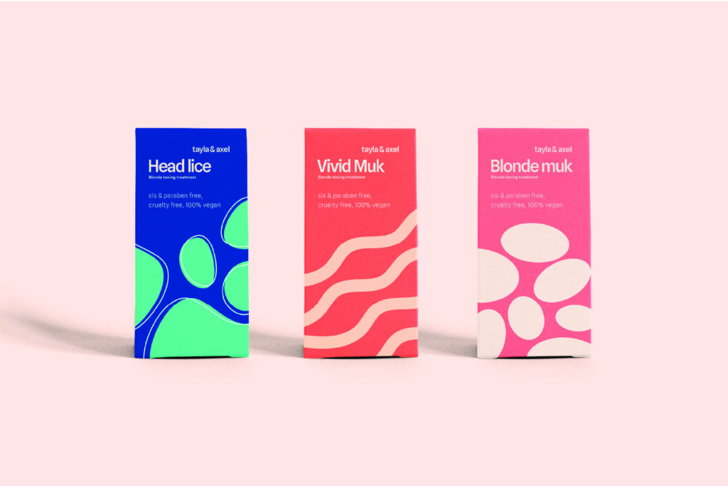
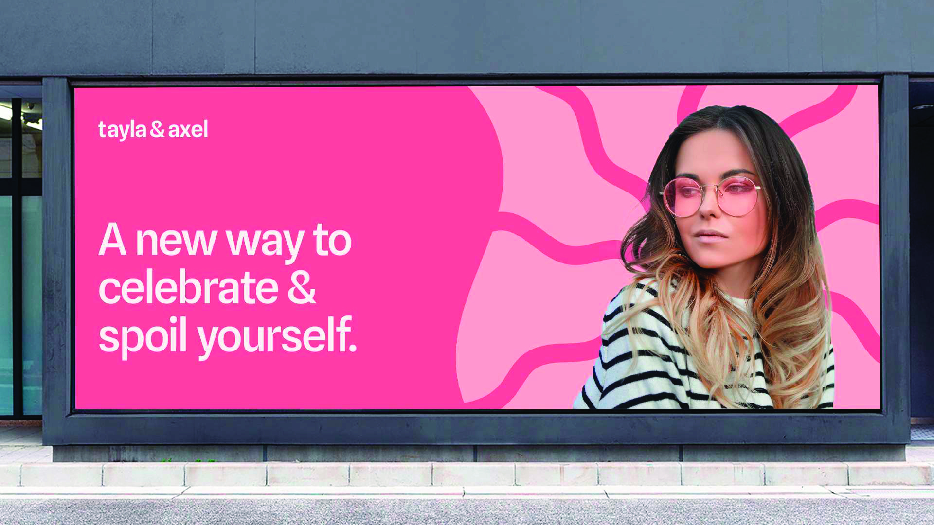
In Tyla & Axel branding, a spirited logotype and confetti-bright palette merges its hair, skincare, and kids’ ranges under one logo while still maintaining flexibility. A playful bug or blob that is the rotating, branded mascot has a simplistic shape that changes based on the product’s use which, combined with the logo’s wobbly lettered font, creates an approachable tone. Hair care packaging incorporates bold, glossy finishes with labels colored in electric lime or cotton-candy pink where cartoon critters are mid-evictioning out of doodle land's chunky, shouty typography
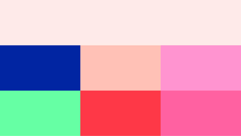
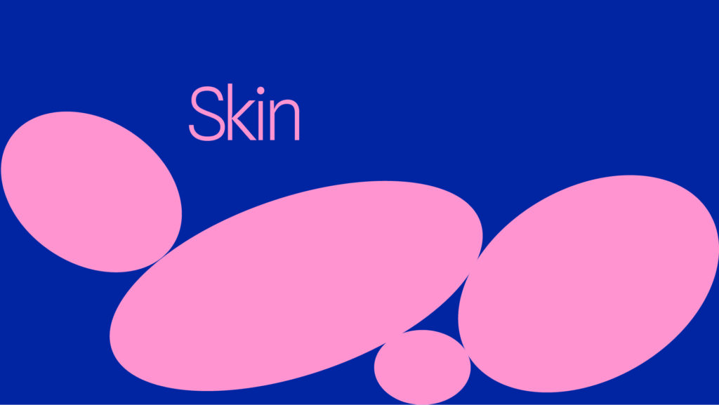
Rounded lowercase cartoon fonts that whisper “gentle science” soften the vibe of the skincare soft matte pastel jars and minimalist blocks. Young consumers stay curious by The kid's range popping with sky-blue bottles and confetti-like patterns that use bouncy typography to create visual and playful curiosity. Confetti accents, rotating mascots, and labels that can be described as “winking at you” are found across all ranges – a proof statement that even when consistency seems impossible, order can be found within the chaos.
Chow Palace, a cloud kitchen with Indo-Chinese cuisine, required a logo that encapsulates its food fusion and new-age delivery-oriented persona. The logo should be versatile to work on menus, packaging, business cards, as well as online platforms, yet convey the flavor of Chinese food with a local touch.
The logo includes a stylized bowl with chopsticks representing Chinese food, combined with "Chow Palace" in rounded, bold type. The design incorporates a purple and gold color scheme—purple for richness, gold for warmth—created on a grid to ensure consistency. The variations involve soft corners and variable spacing (loose to tight optical spacing) to facilitate flexibility across mediums such as aprons, signs, and mobile apps.
The logo is minimalist and iconic, perfectly conveying Chow Palace's Indo-Chinese heritage. It functions smoothly on menus, business cards, aprons, and online screens, improving brand presence and salability in the crowded cloud kitchen space.
NBM Industries is a proficient and equipped producer of PVC Insulated Busbar Systems (DSL), C-rail (Festooning) Systems, as well as Forming Products such as different vertical and horizontal mounting means for finger-safe applications employed in cranes and monorails.
The business required a logo that would symbolize its industrial know-how, technical precision, and dependability while being versatile.
Designing started with an in-depth understanding of NBM's key business operations and industrial setup. This gave rise to a striking, geometric logo via the use of the acronym "NBM" in a simple, sans-serif wordmark. The letterforms are minimally angular with minimal cuts, giving a technical and structured feel without compromising function.
A high-contrast color scheme—traditionally white or light gray on black—was used to convey professionalism, precision, and strength. The logo was constructed on a grid layout in order to uphold symmetry and proportion, guaranteeing consistent usage across varying scales and media.
Mockups were tested with the logo on print and digital items, such as promotional products, signs, and packaging. The end product is a multi-faceted, durable, and very distinctive design that emphasizes NBM Industries' position as a respected name in the industrial market.
Through the combination of industrial imagery with clean, contemporary style, the NBM logo successfully transmits the values of the company—precision, innovation, and reliability—on every platform.
EQ Rig is an innovative tech brand that provides bespoke and pre-fabricated PC rigs for performance, reliability, and sophisticated looks. Its visual identity consists of a clean, tech-savvy logo with interlocking lines—like circuit paths—that symbolize precision engineering and advanced hardware solutions.
The red-purple gradient infuses the perception of energy and innovation, with the strong typography and dark theme complementing the brand's emphasis on bleeding-edge technology. Whatever your background is - gamer, content creator, or power user - EQ Rig provides rigs customized to your needs.
Brand materials such as business cards, letterheads, and packaging have a crisp, futuristic look, with clean design and high contrast. The outcome is a consistent, professional brand that communicates EQ Rig's purpose: to amp up your performance with custom and ready-to-use PC rigs designed to last.
Hashrate Factory is a high-performance PC rig manufacturer for cryptocurrency mining, emphasizing speed, power, and profit. The logo design combines these three concepts into one strong visual identity. The idea is based on rising bars and forward-moving forms, representing profit and speed. These also smartly create the initials "H" and "F", providing the mark with meaning and recognition. Diagonal lines mark growth and momentum, while the simplicity of design represents technical expertise and dependability. The robust geometric framework maintains the logo clean and contemporary, similar to the advanced crypto mining world.
The logo is designed to be flexible and consistent across all touchpoints—mobile apps and websites, merchandise, and business cards. Its simplicity guarantees legibility at small sizes, and its distinctive shape makes it memorable on any platform. The end result is a crisp, scalable identity that conveys Hashrate Factory's essential promise: fast, high-performance systems for serious mining profitability.
MySkillZoo is an education platform designed to help people learn new skills in a simple and welcoming way. The branding needed to reflect intelligence and approachability, ensuring users feel encouraged to grow their abilities. The goal was to create a visual identity that feels smart, trustworthy, and easy to connect with for anyone looking to improve.
The brand centers on a fox logo with glasses and a blue color scheme. The fox represents cleverness and adaptability, perfectly matching the platform’s focus on skill-building. The blue color adds a sense of calm and trust, paired with white for a clean look. This design appears consistently across the app, billboards, and even coffee cups, making MySkillZoo instantly recognizable bringing the brand into everyday moments. This cohesive approach ensures the branding feels professional yet friendly, supporting MySkillZoo’s mission to make learning accessible and part of users’ lives.
Skinwise is a skincare brand that aims to build trust with customers by focusing on science and honesty. In a market full of flashy skincare products, the branding needed to feel reliable and fresh, appealing to people who want clear, effective solutions for their skin.
The brand uses a geometric, sans-serif wordmark that looks like lab equipment and molecular shapes, tying it to science without feeling cold. The colors—slate grays, clinical whites, and a touch of teal—blend a lab-like precision with a calming, nature-inspired feel. This mix makes Skinwise look trustworthy and approachable. On the packaging, the design organizes ingredient lists into neat, scannable columns with bold borders, all on a glass-finish material. This setup highlights the product’s scientific roots while making it stand out on shelves. The clear layout and balanced colors work together to show Skinwise as a brand that’s honest, professional, and easy to understand for anyone seeking real skincare results.