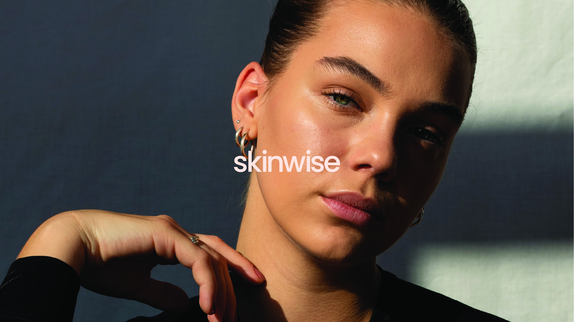
Skinwise is a skincare brand that aims to build trust with customers by focusing on science and honesty. In a market full of flashy skincare products, the branding needed to feel reliable and fresh, appealing to people who want clear, effective solutions for their skin.
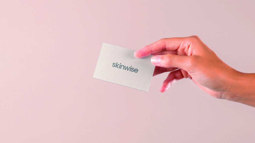
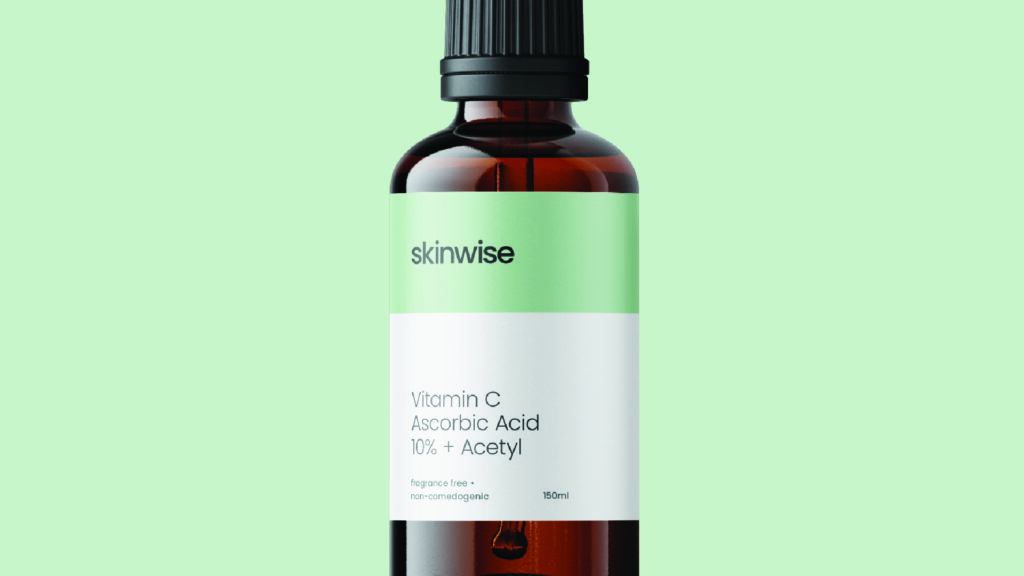
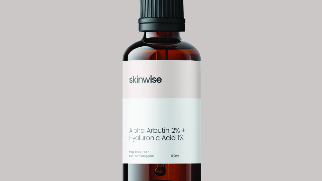
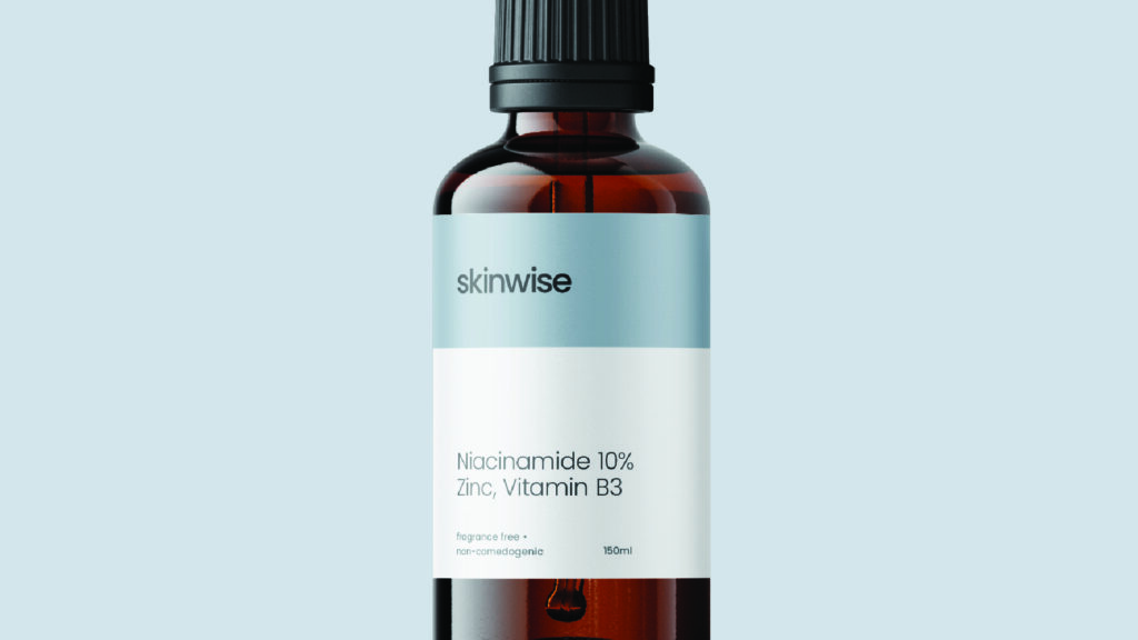
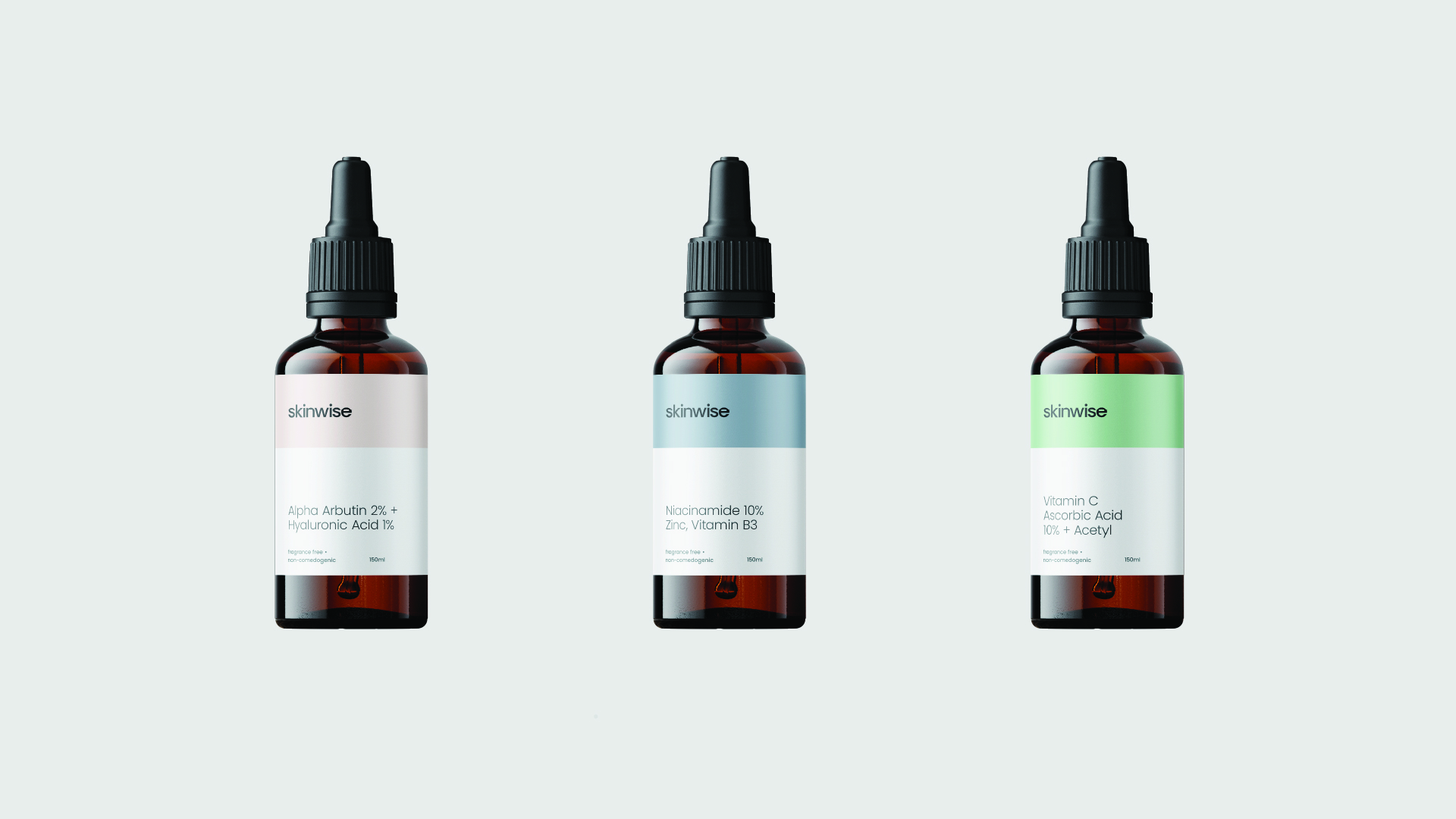
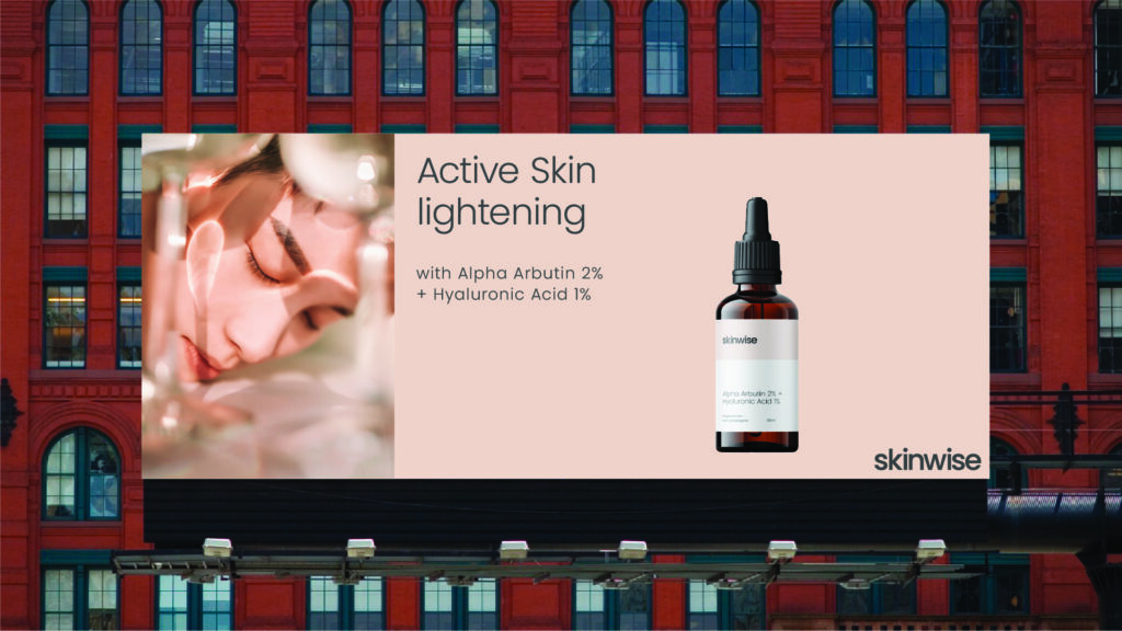
The brand uses a geometric, sans-serif wordmark that looks like lab equipment and molecular shapes, tying it to science without feeling cold. The colors—slate grays, clinical whites, and a touch of teal—blend a lab-like precision with a calming, nature-inspired feel. This mix makes Skinwise look trustworthy and approachable. On the packaging, the design organizes ingredient lists into neat, scannable columns with bold borders, all on a glass-finish material. This setup highlights the product’s scientific roots while making it stand out on shelves. The clear layout and balanced colors work together to show Skinwise as a brand that’s honest, professional, and easy to understand for anyone seeking real skincare results.